Every book has a story. This one has two covers—and the change from the original edition to the new artwork tells a story of its own.


A New Cover for the Same True Story
When I first published Capone of Cannabis, the art leaned into the imagery of Michigan’s early cannabis years: green fields, a suited figure, and the feeling of an industry that was just beginning to take shape. It captured one side of the story—but the book reaches far beyond that moment.
The memoir moves from dispensary counters to police raids, courtrooms, and federal prison. It is about what happened when Michigan voters changed the law and the people enforcing it did not always move in the same direction. The new design needed to carry that darker, more complicated history without trying to illustrate every chapter at once.
Cover Art by Lindsey Naylor of Home Squirrel
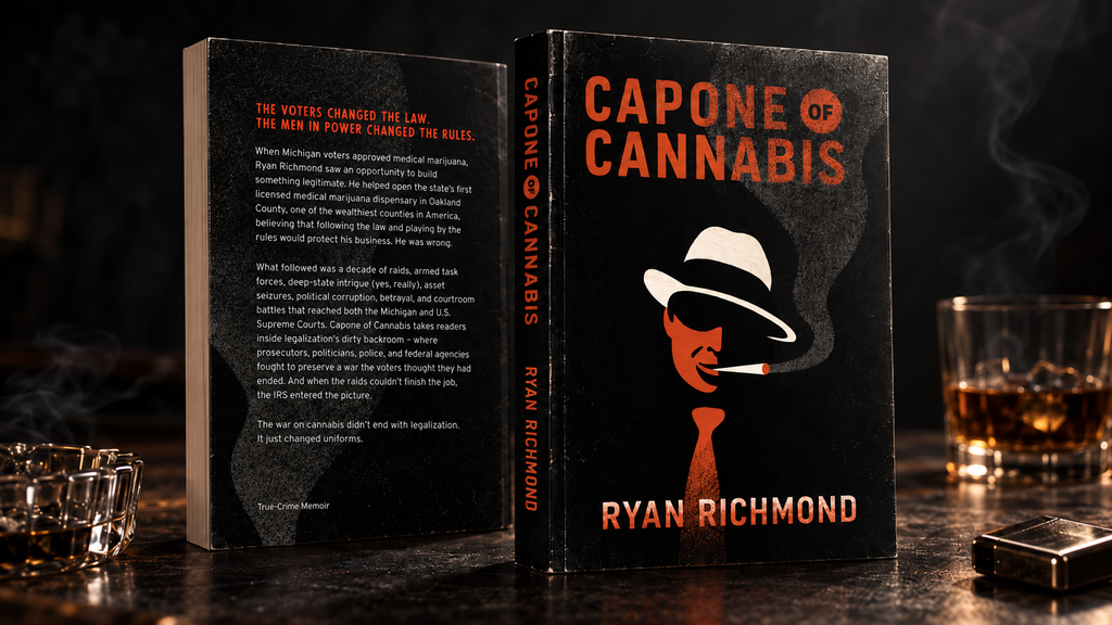
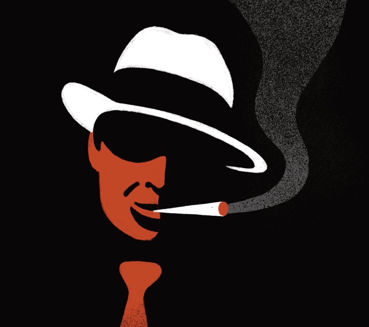
Michigan artist and graphic designer Lindsey Naylor of Home Squirrel created the new cover artwork. Her design uses a limited palette, textured lettering, and a bold noir silhouette. The white fedora draws your eye first. The face falls into shadow, and the smoke carries through the rest of the composition.
The burnt-orange title and author lettering stand out against the black. The result is intentionally spare: no crowded montage of headlines, officers, court buildings, or money. The image lets the reader wonder what happens next.
Why the New Look Fits the Book
The old cover suggested the start of the green rush. The new one reflects what followed. Raids, corruption, the CIA, and the IRS are all part of the memoir’s subtitle, but the artwork leaves room for readers to discover the details for themselves.
“The voters changed the law. The men in power changed the rules.”
The redesigned cover now anchors the book’s website and related visuals. The original edition is part of the history, and I wanted readers to see both side by side.

Cover art: Lindsey Naylor / Home Squirrel.